Why Your ‘Pretty’ Website Isn’t Converting (And What to Do About It)

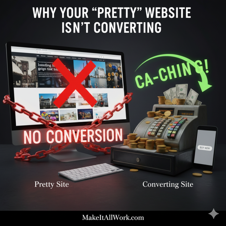
At MakeItAllWork, we encounter a common frustration: a client invests heavily in a stunning, high-end website, but the contact form stays empty, and sales remain flat. The site looks amazing, but it fails to achieve its primary goal: converting visitors into customers.
The truth is, a beautiful website is only the price of entry. Conversion is about clear communication, trust, and psychological principles. A site that looks great but doesn’t get users to act is fundamentally broken.
Let’s dive into the core principles of User Experience (UX) and design that turn passive visitors into engaged clients.
1. Is Your Call to Action (CTA) Invisible or Confusing?
The CTA is the single most important element on your conversion page. If it’s not working, nothing else matters.
- The Problem: Many beautiful designs prioritize subtlety. CTAs are often hidden in plain sight—using the wrong color, buried in dense text, or using vague language like “Click Here” or “Submit.” Visitors get confused about the next step or simply miss the opportunity to act.
- The Fix: CTAs must be conspicuous, clear, and compelling.
- Visual Hierarchy: Use high-contrast colors (e.g., your brand accent color) that stand out against the background. Give the button ample negative space.
- Clarity: Use action-oriented language that conveys value, such as “Get Your Free Audit,” “Start My Project,” or “Download the Guide Now.”
- Consistency: Use a consistent look and placement for CTAs across your site.
2. Are You Suffering from Cognitive Overload?
When you give visitors too many options or too much information at once, they often choose none of them. This is known as “The Paradox of Choice.”
- The Problem: Design often encourages overcrowding: too many navigation links, too many sliders, too many pop-ups, and too much text above the fold. This forces the user’s brain to work too hard to process what you offer, leading to immediate frustration and exit.
- The Fix: Simplify and prioritize.
- Focus on One Goal: Each page should have a single, primary objective and a clear path to the main CTA.
- Use Visual Hierarchy: Guide the user’s eye using size, color, and spacing. The most important information (your value proposition) should be the first thing they see.
- Minimize Navigation: Keep your primary navigation menu clean and focused on 5-7 key links.
3. Have You Failed the Mobile Experience Test?
We’ve covered this before, but it bears repeating: conversion happens on mobile.
- The Problem: A “pretty” desktop design can become an unusable, frustrating mess on a smartphone. Clumsy forms, tiny buttons, text that requires zooming, and slow load times on mobile are conversion killers, as the majority of initial traffic comes from mobile devices.
- The Fix: Adopt a Mobile-First approach.
- Ensure Thumb Reach: Place important CTAs and navigation elements within easy reach of a user’s thumb.
- Simplify Forms: On mobile, forms should be as short as possible. Use auto-fill, large fields, and clear error messaging.
- Load Speed: Aggressively optimize images and code for lightning-fast mobile performance.
4. Are You Asking for Trust Without Earning It?
Users will not share their email, let alone their credit card details, with a site they don’t trust.
- The Problem: Many beautiful sites look corporate but lack the human touch or clear proof points needed to establish credibility. Missing elements like testimonials, security badges, or clear company contact information breed skepticism.
- The Fix: Build Authority and Trust.
- Social Proof: Place high-quality client testimonials, case studies, and logos of notable clients prominently near relevant CTAs.
- Security: Clearly display security seals (like SSL/HTTPS badges) for checkout or contact forms.
- Transparency: Ensure your pricing, guarantees, return policies, and contact information are easily accessible. A professional “About Us” page builds essential rapport.
5. Is Your Content All About You, Not Them?
Visitors don’t care about your company history; they care about how you can solve their problems.
- The Problem: Many websites lead with self-focused language: “We are the best company…” or “We offer innovative solutions…” This ego-centric content fails to engage the user emotionally.
- The Fix: Focus on the Value Proposition and the User.
- “You” Language: Shift your language to focus on the user’s pain points and the benefits they will receive. Start sentences with “You will save time,” or “Achieve X results.”
- Value Proposition: The first words a visitor reads must clearly and concisely state the benefit of using your product or service.
Stop Admiring Your Website and Start Measuring Its Success!
A beautiful website is an asset only if it’s designed to achieve measurable business goals. If your aesthetically pleasing site isn’t generating the leads or sales you expect, it needs a conversion-focused audit and overhaul.
At MakeItAllWork, we move beyond superficial aesthetics. We specialize in Conversion Rate Optimization (CRO), redesigning key user flows, refining CTAs, and structuring content based on proven UX principles to maximize the conversion power of your design.
Ready to stop showcasing and start selling?
Click here to contact us for a free Conversion Audit of your website and turn your beautiful design into a high-performance sales machine!

 ALL BLOGS


