 ALL BLOGS
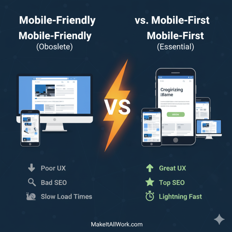
‘Mobile-Friendly’ vs. ‘Mobile-First’: Why One is Obsolete (And Why It Matters to Your Business)
At MakeItAllWork, we live and breathe modern web design. We’re constantly evolving our strategies to ensure our clients’ websites don’t just look good, but perform exceptionally for all their users, on any device.
You might hear terms like “mobile-friendly” or “responsive design,” but if your web partner isn’t talking about a “mobile-first” approach, they might be stuck in the past. In today’s digital landscape, the difference isn’t just semantics—it’s the foundation of your online success.
Let’s break down why “mobile-first” is non-negotiable and why anything less is, frankly, obsolete.
What’s the Big Deal? Aren’t ‘Mobile-Friendly’ and ‘Mobile-First’ the Same Thing?
No, and understanding the difference is crucial for your business.
- ‘Mobile-Friendly’ (The Obsolete Approach): This approach starts with designing and building a website for the large desktop screen first. Once the desktop version is complete, designers then try to adapt or “shoehorn” that content and layout to work on smaller mobile screens. It’s an afterthought, trying to make a big thing fit into a small box.
- ‘Mobile-First’ (The Modern, Essential Approach): This is where we start. We begin the design and development process by creating the experience for the smallest screens (smartphones) first. We prioritize the core content and essential functionality, ensuring a seamless and fast experience on mobile. Only after the mobile experience is perfected do we progressively enhance it for larger screens like tablets and desktops, adding more complex layouts or supplementary content as screen real estate allows.
Why is ‘Mobile-Friendly’ now considered obsolete?
It’s obsolete because user behavior and Google’s priorities have fundamentally shifted:
- Mobile Domination: The vast majority of internet traffic now comes from mobile devices. For many businesses, over 70% of their users are on smartphones. If your site isn’t optimized for these users first, you’re alienating the majority of your audience.
- Google’s Mobile-First Indexing: This is the game-changer for SEO. Google now primarily uses the mobile version of your website for ranking and indexing. If your mobile site is a stripped-down, poorly optimized version of your desktop site, you’re actively hurting your search rankings.
- Performance Issues: Retrofitting a desktop design for mobile often results in slower load times, clunky navigation, and a poor user experience on smaller screens. This leads to high bounce rates and lost conversions.
- Content Bloat: Desktop-first designs tend to include a lot of unnecessary content and complex layouts that overwhelm mobile users, making it hard to find what they need quickly.
How does a ‘Mobile-First’ approach benefit my business?
Adopting a mobile-first strategy isn’t just about keeping up with trends; it provides tangible, measurable benefits for your bottom line:
- Superior User Experience (UX): By focusing on mobile first, you’re forced to prioritize core content and clear calls to action. This results in an incredibly intuitive, fast, and satisfying experience for the majority of your users, leading to higher engagement and satisfaction.
- Massive SEO Advantage: As mentioned, Google indexes your mobile site first. A truly mobile-first design, built for speed and clarity on smaller screens, naturally performs better in mobile search rankings, driving more organic traffic.
- Faster Load Times: Stripping away unnecessary elements for mobile first means your site loads incredibly fast. This is crucial for user retention and SEO.
- Higher Conversion Rates: When users can easily navigate, find information, and complete actions (like making a purchase or filling a form) on their phones, they are far more likely to convert.
- Future-Proofing: Designing for the smallest screen first prepares your site for any new device that might emerge. Your content is structured in a way that is adaptable and scalable.
- Cost-Effective in the Long Run: While it might seem counter-intuitive, designing mobile-first can save money. It simplifies the design process by focusing on essentials, and avoids costly redesigns or fixes later to “make it work” on mobile.
What should I ask my web designer or developer?
If you’re considering a new website or a redesign, always ask:
- “What is your approach to mobile design?”
- “Do you prioritize the desktop experience and then scale down, or do you build for mobile first and then progressively enhance?”
- “How do you ensure optimal performance and user experience on smartphones?”
- “Can you show me examples of sites you’ve built using a mobile-first strategy?”
The answers will tell you a lot about their understanding of modern web standards.
Is Your Website Stuck in the Past? Let’s Future-Proof It!
If your current website was designed with a “desktop-first, mobile-friendly” mindset, you’re likely losing customers, hurting your search rankings, and providing a frustrating experience for the majority of your audience.
At MakeItAllWork, we champion a robust mobile-first design and development process. We ensure your website not only looks incredible on every screen but performs flawlessly, driving better engagement, higher conversions, and stronger SEO.
Don’t settle for “mobile-friendly” when “mobile-first” is the clear path to success.
Contact us to schedule a free consultation with MakeItAllWork and discover how a mobile-first approach can transform your online presence!